Indi Website Redesign
How I turn browsers into buyers.

MY ROLE
UX designer, information architecture, design system
TIMELINE
3 months, Mar-Jun 2024
PROJECT TYPE
Delivered, industry-sponsored project
PROBLEM
Indi Chocolate lost 63% of customers at checkout due to confusing navigation and a broken booking system.
OVERVIEW
As lead UX designer in a three-month partnership with Indi Chocolate, I conducted research, prototyping, and testing to redesign their website. The result: 48% reduction in cart abandonment and 36% fewer support calls.
SKILLS
CONTEXT
Indi Chocolate is a local chocolatier offering products, classes, and events in a café and retail space.
Current issues
Hard to find product
Inconsistent design
Confusing navigation
Broken booking system

PAINPOINT
63% cart abandonment rate & reduce support inquiries.
After testing with 15 users and analyzing support tickets, the challenge was clear, we are actively losing money.
“Classes open for signup aren’t clear.”
“The site feels overwhelming—I had to call instead.”
“I couldn’t find what I needed.”
📉 63% cart abandonment
Customers were leaving before purchase.
⚡ High support call
Users couldn't find basic infos.
⛓️💥 Broken booking system
Classes & events were impossible to register.
CHANGES
Where do I start when checkout becomes the drop-off point?
What did i do…
I grouped the findings into two categories: navigation chaos and system failures. After presenting these to Indi's owner, I restructured the information architecture using card sort and tree test.
Simplified Information Architecture
🆕 Navigation: From 7 Items → 4 Clear Categories
How: I rebuilt the site around users’ mental models, testing navigation with 20 new and returning visitors.

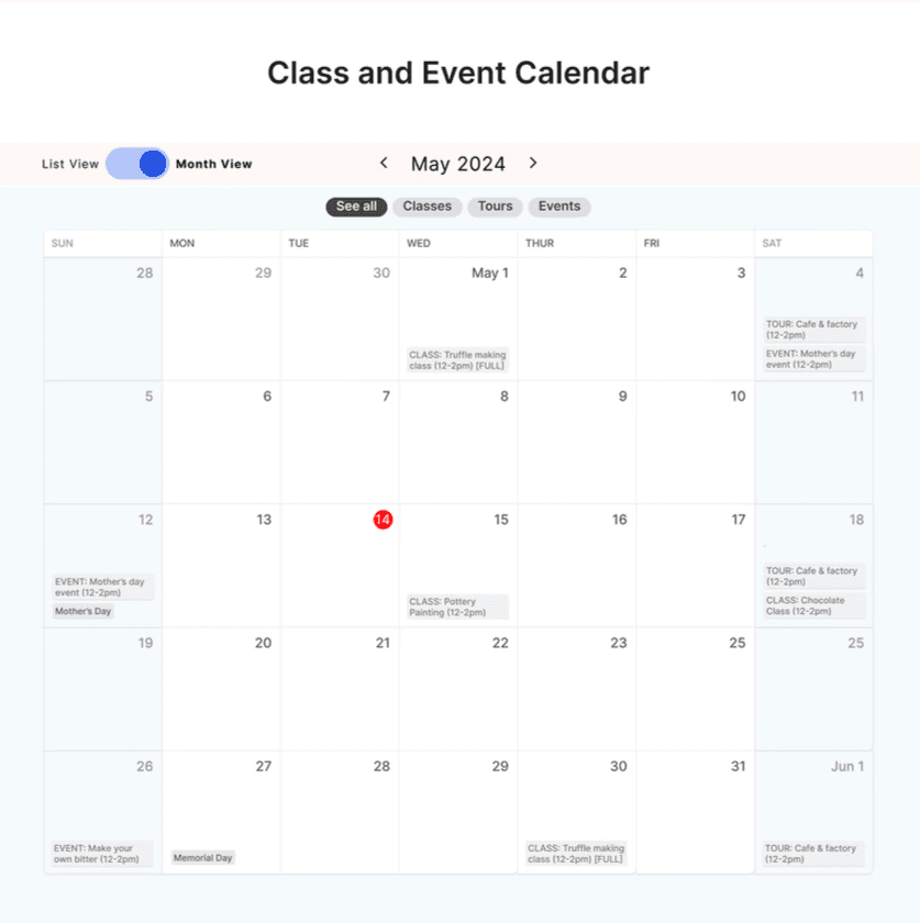
Unified Booking Systems
🆕 A single, robust booking experience
I designed calendar and list views, combined classes and events into one page, and displayed content, skill level, and inclusions upfront.


Authentic Brand Expression
🆕 I translated their bean-to-bar story into a visual language.
Blended artisanal authenticity with modern usability and designed for emotional connection.

LOOKBACK
This project was special..
The business is named after the owner's daughter, Indi. That personal connection made every design decision feel weightier—this wasn't optimizing for a corporation, it was helping a family keep their business alive. Good design became less about what looks right and more about what actually works.