KIDOOO AI X EDTECH • LAUNCHED 2024
Designing evaluations that feel personal
ROLE
Product designer
TIMELINE
May - Oct 2024
TEAM
3 Designers
1 Researchers
1 Engineer
SKILLS
Product Design
Product Strategy
PROBLEM
How do you design an AI parenting app that guides parents while staying engaging for kids?
OVERVIEW
Joining at the whiteboard stage, I grew with the team from 3 to 8 designers across V2.0-V4.0. I led user research with families, rebuilt the design system, and created the evaluation framework and AI features that increased task completion by 37%.
TOOLS
CONTEXT
Over one million brain connections form per second in early childhood. Only once.
The first five years shape how children think, learn, and handle emotions for the rest of their lives. But quality early childhood development costs $200-300 per week, putting it out of reach for 2 out of 3 American families.
01 Financial Constraints
02 Systemic Issues
03 Resource Availability
PROCESS
I helped ship versions 2.0–4.0 in six months, boosting task completion by 37%.
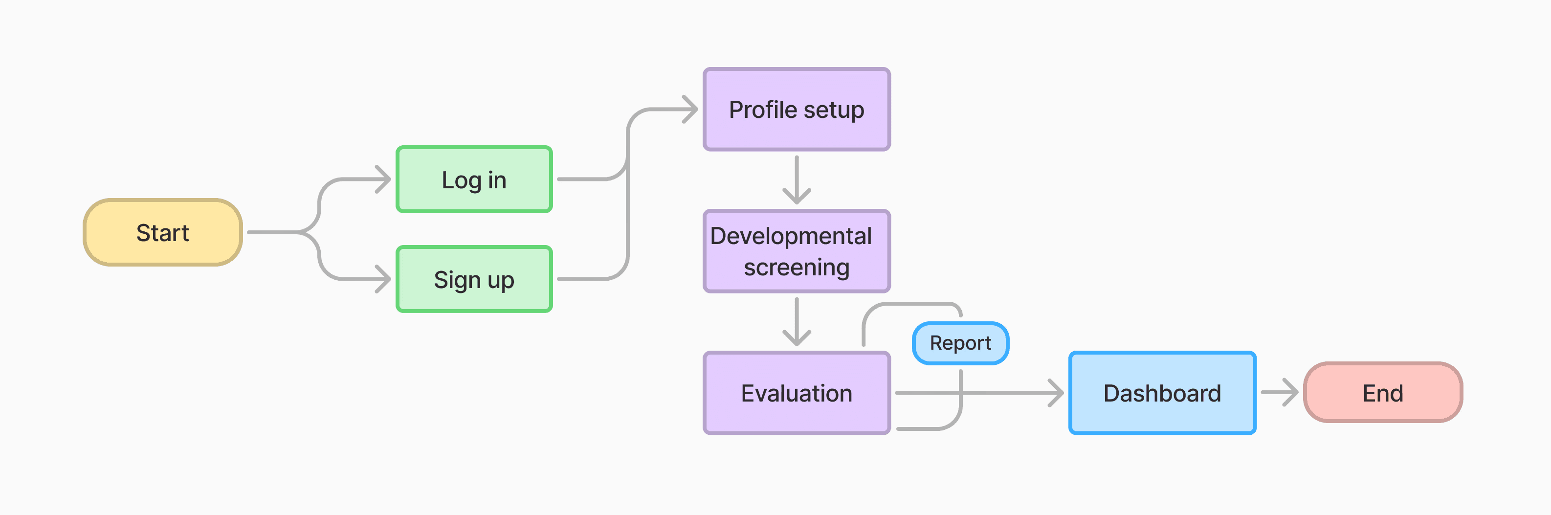
I joined at the whiteboard stage to build an AI app that guides parents through personalized tasks and tracks child development across onboarding, daily use, and progress tracking.
PAIN POINT
V2 feedback revealed we designed for parents but forgot children were users too.
V2 user feedback revealed two critical issues that must be addressed before launching V3.
Visual Chaos
❌ A rainbow mess, inconsistent colors, no system, and user were lost.
Parent-Centric Design
❌ Muted, “professional” colors.

DESIGN SYSTEM
Simplified palette & Systematic consistency
What I did...
I led a complete design system overhaul with our design team, establishing clear principles:
Simplified palette: 1 primary, 1 secondary—bright and engaging, not overwhelming
Systematic consistency: Unified typography, layout, borders, and components


ITERATIONS
How do you iterate toward child-first interactions?
I held weekly design critiques with the founder and an engineer to iterate for better engagement while maintaining intuitiveness.
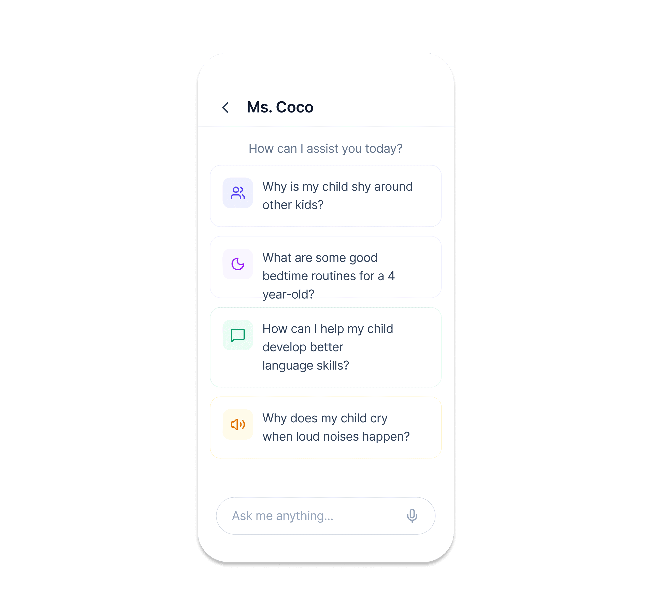
Intuitive Interface
💬 How can we help children navigate faster?
💡 I added visual cues and icons alongside text.
Better Engagement
💬 How do we balance quick answers with meaningful engagement?
💡 I included both quick FAQs and thought-provoking questions for different interaction depths.
Higher Retention
💬 How do we keep kids coming back and excited to learn?
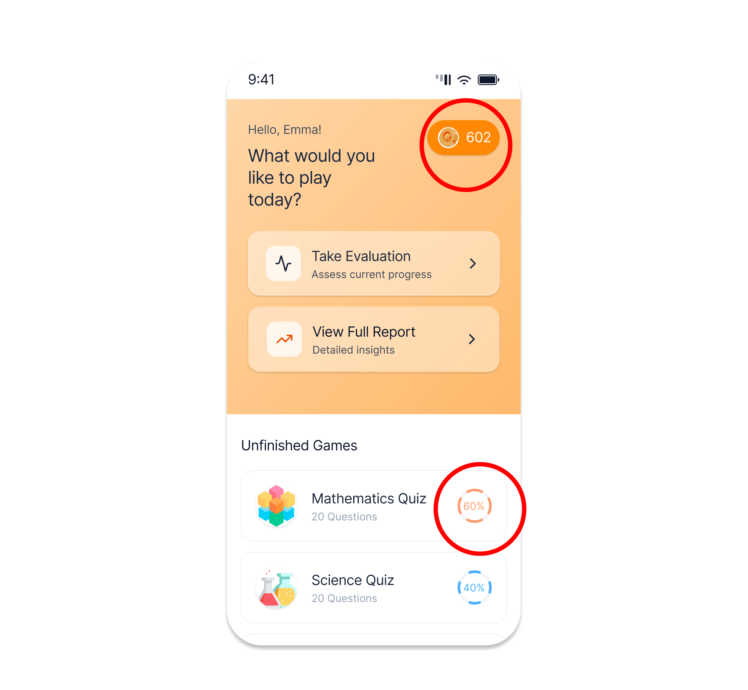
💡 I added a reward system and progress tracking for better engagement.
CHALLENGE
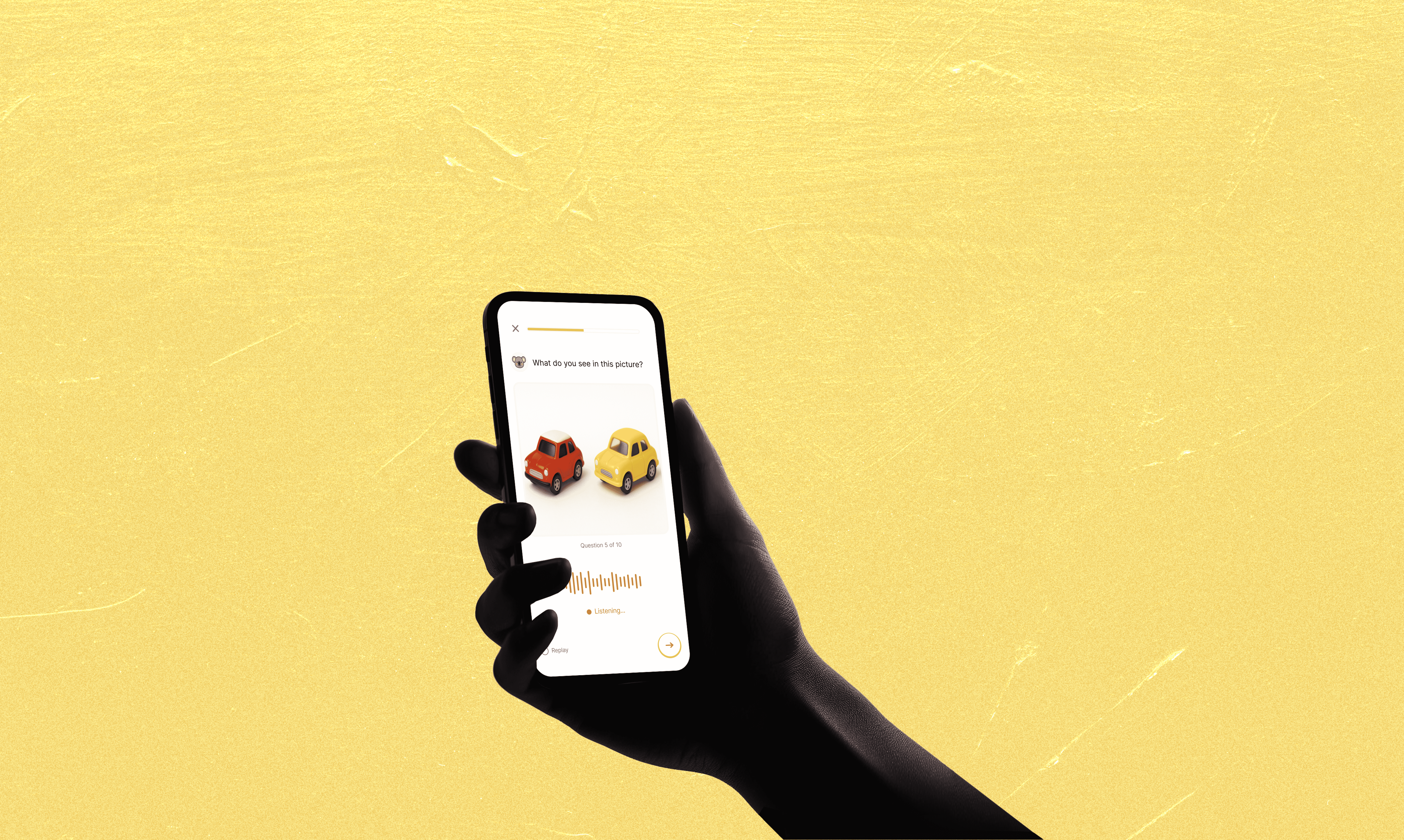
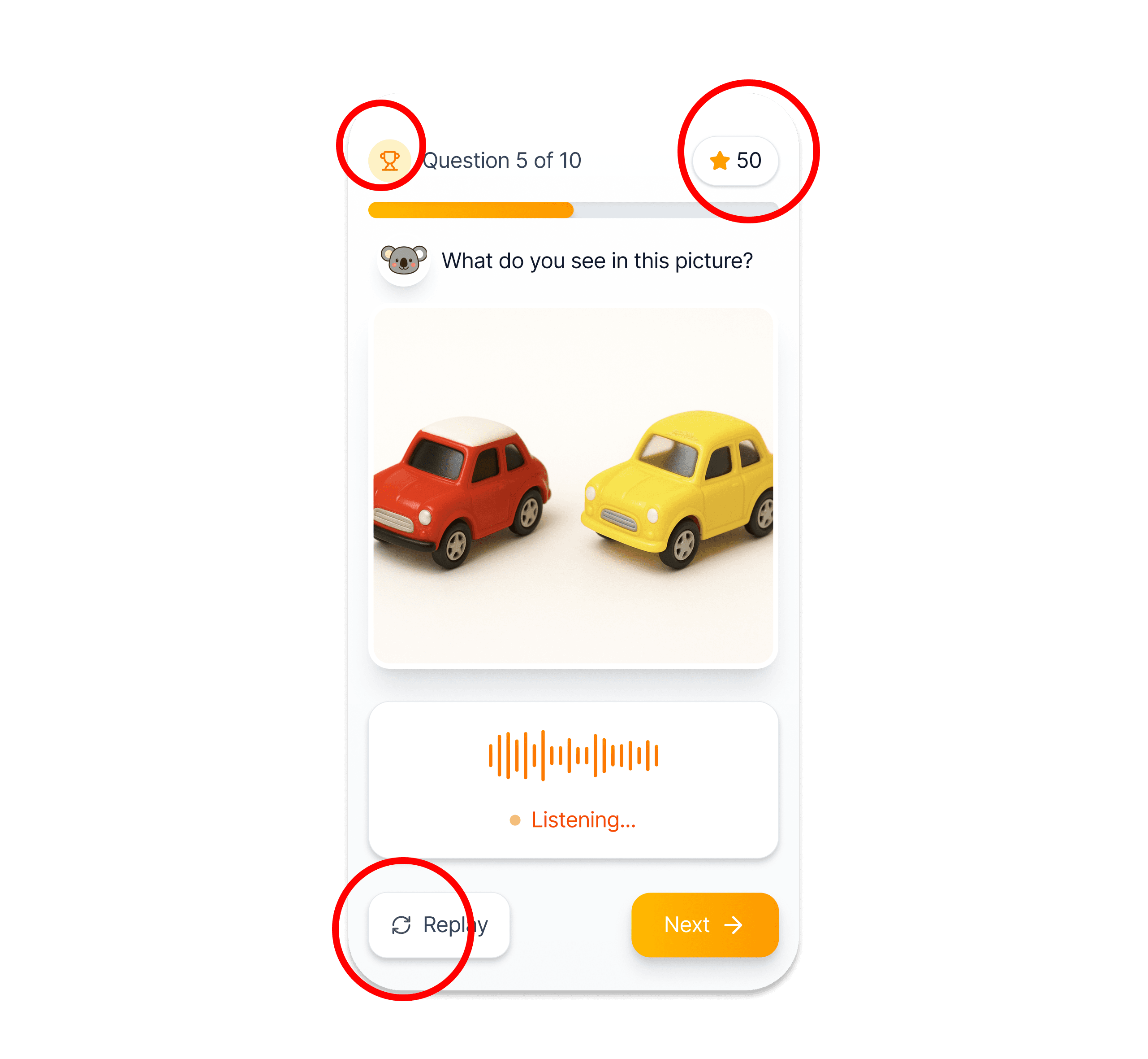
The Core Product: AI-Powered Evaluation Tasks
The evaluation tasks became the heart of Kidooo AI. While I can't share detailed designs due to NDA, I can share what made this work unique.
🚧 The Complexity
Designing this AI assessment was hard, but balancing all those factors taught me the most.
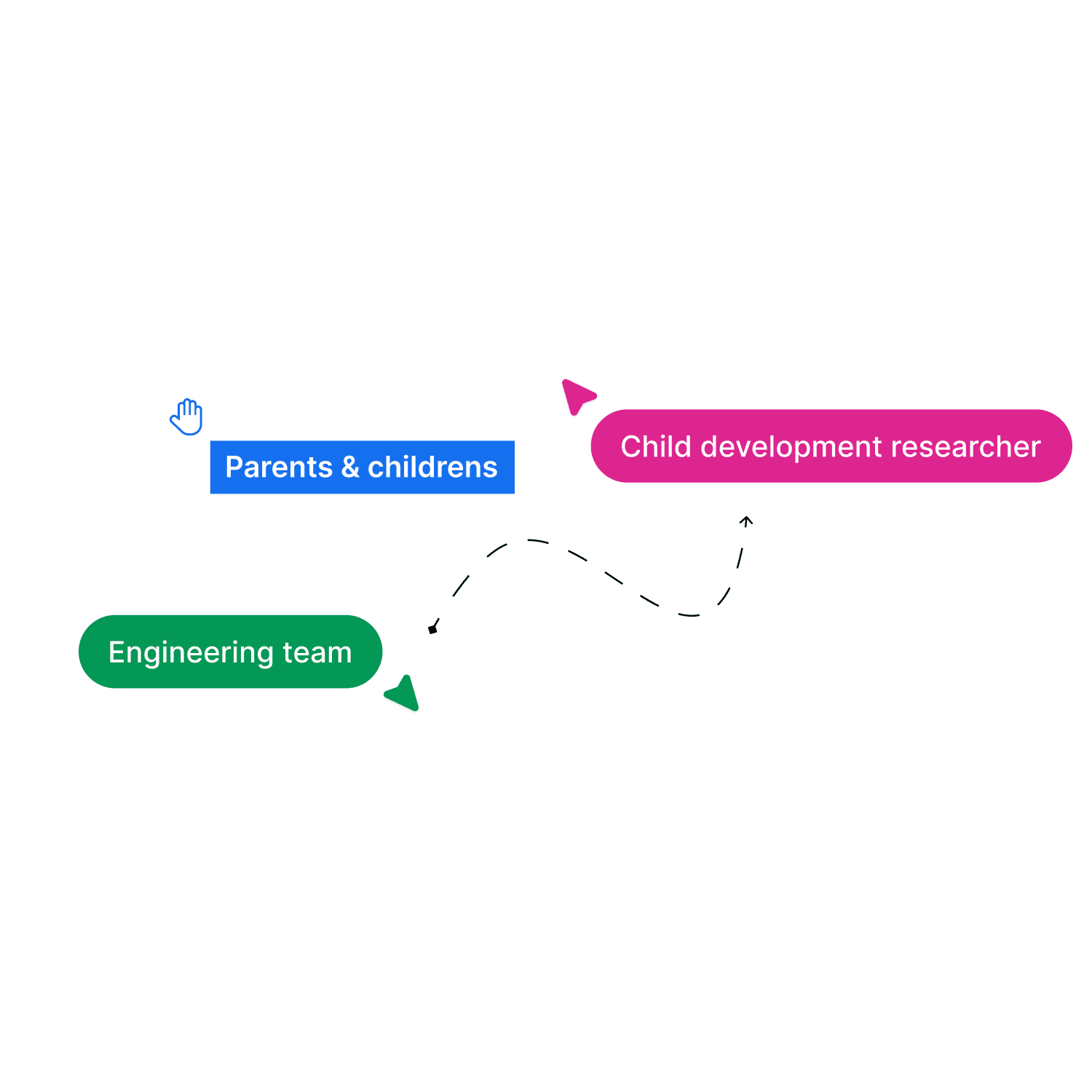
👥 Cross-Functional Collaboration
With child development researchers, I learned what kids can actually do at each age.
With engineers, I learned AI's capabilities and constraints.
With families, I learned to speak for them.
LOOKBACK
I guess…it's okay to make mistakes
Make Mistakes
Daily crituque
Check back with Yun
V3 feedback
My first time designing AI for children taught me something crucial: constraints aren't the enemy. Developmental milestones, AI limitations, small team chaos, understanding those deeply made the work better, not harder. Messy and thrilling.
HIGHLIGHTS
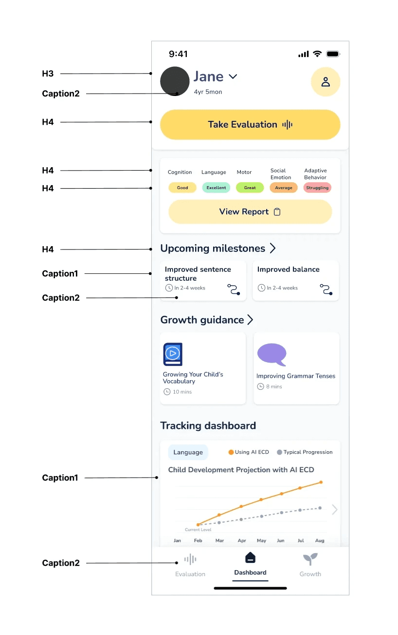
Personalized Dashboard
Conversational Interface
1 stop for communication in Education
4+
Hours saved weekly
37%
Reduction in platform switching
CONTEXT
Over one million brain connections form per second in early childhood. Only once.
The first five years shape how children think, learn, and handle emotions for the rest of their lives. But quality early childhood development costs $200-300 per week, putting it out of reach for 2 out of 3 American families.

Two users, One solution
Q: Students want speed. Instructors want control.
A: AI uses course materials. No answer? Routes to instructor.
SOLUTION
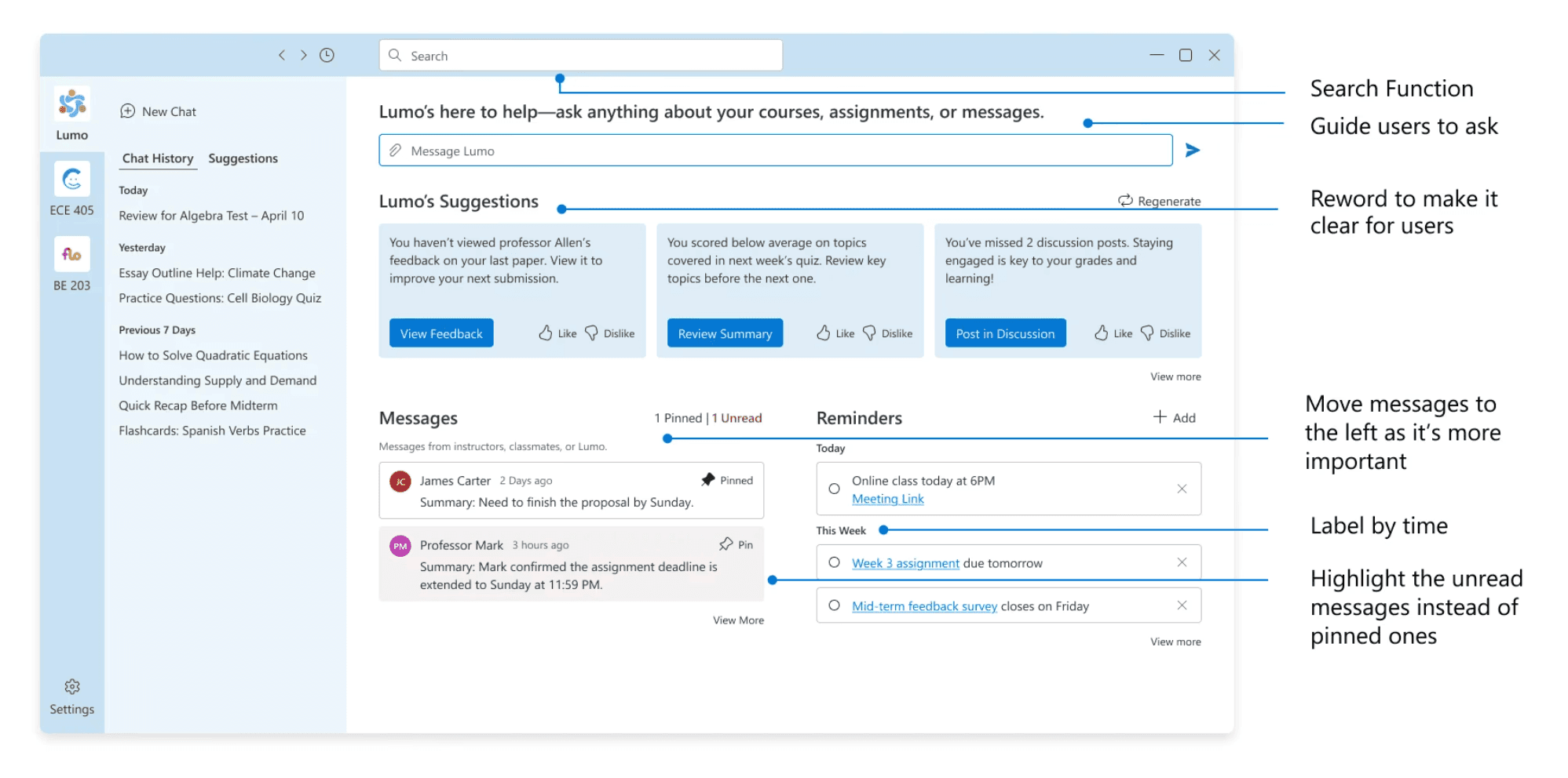
Minimize platform switching to simplify communication.
We designed an AI assistant integrated learning management system(LMS) using ACS components to streamline communication.
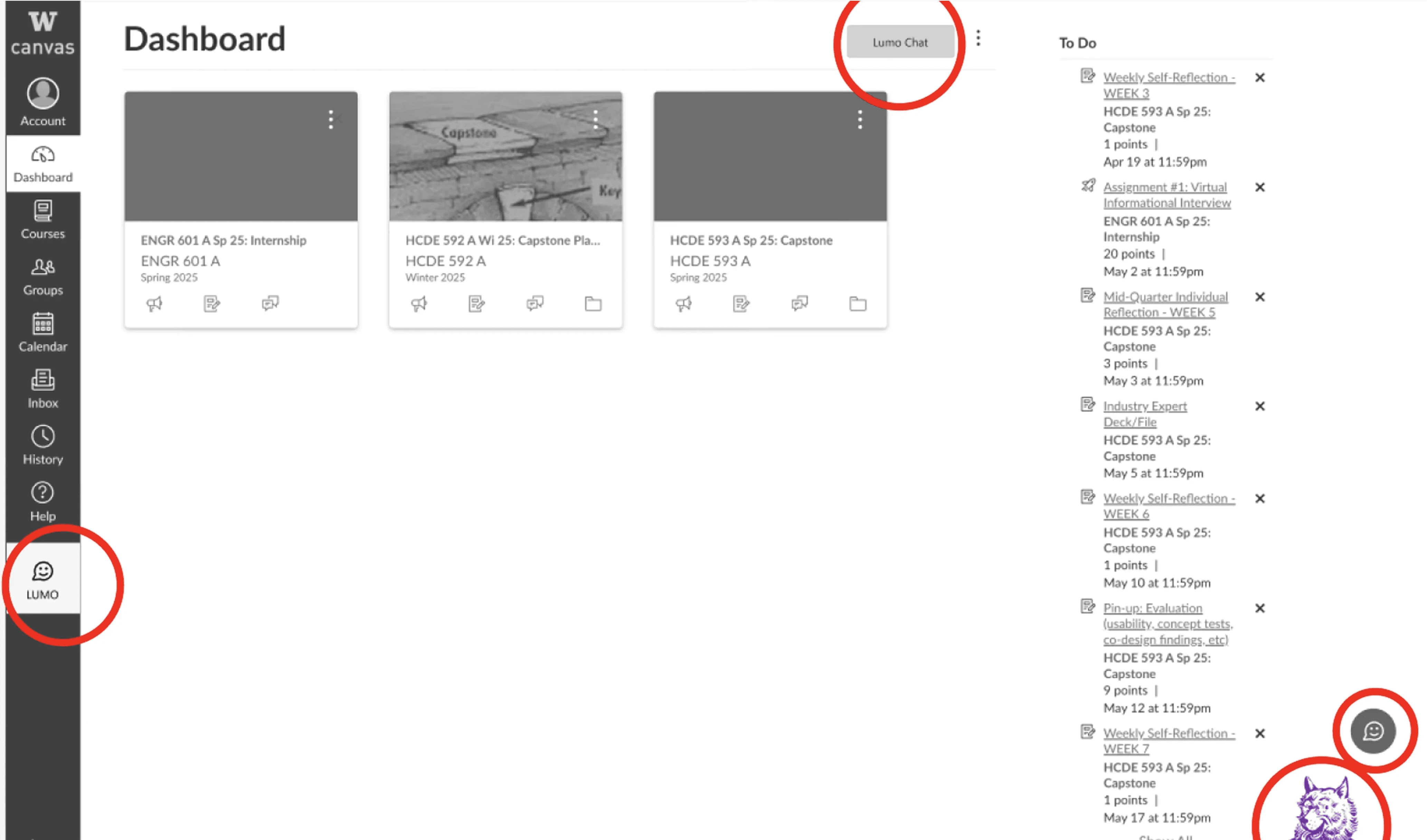
24/7 Immediate Support
Lumo provide 24/7 support when educators are offline, writing support, and smart question routing.
Stop Jugging Platforms
All-in-one communication hub featuring smart message organization, search, and office hours scheduling.
Automate the Busywork
Pattern recognition and automated FAQ response (your control) + smart reminders.
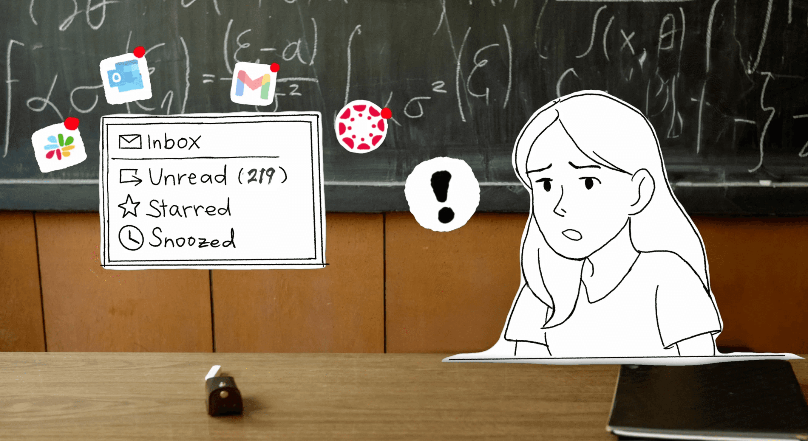
RESEARCH
Exploring product direction and scope.
Over three months, we used multiple research methods to understand higher education communication, identify pain points, and find opportunities for AI.
00 Literature Review
01 Interviews
02 Participatory Design
Purpose
Establish baseline understanding and avoid reinventing the wheel
Academic papers: Education technology adoption, asynchronous communication patterns
Industry reports: EdTech market trends, communication tool usage in education
Existing solutions: What's been tried? Why did some fail?


CHALLENGE
How do I identify and leverage the factors that matter most?
The good thing is I found more insights than I expected. But the hard part was accepting that I can't solve every pain point within our constraints, so I had to let go of “perfect” and focus on creating real impact.
🤝
Two users, One solution
Q: Students want speed. Instructors want control.
A: AI uses course materials. No answer? Routes to instructor.
🤖
Technical constraint
Q: Microsoft ACS can't integrate Slack or Gmail.
A: Centralize all communication within the LMS.
FEATURE REQUEST
Translating needs into features.
Despite numerous feature requests, I identified distinct needs between our two user groups. I created jobs-to-be-done maps for each group to visualize their workflows and organized requests into three guiding principles.

Personalized Dashboard
Centralized view, smart reminders, and AI powered suggestions.
Flexible Communication
One stop for direct message, group chat, and huddle.
Contextual AI Support
24/7 AI support, writing support, and automated tasks.
PUSHBACK
Iterate to improve transparency and AI integration.
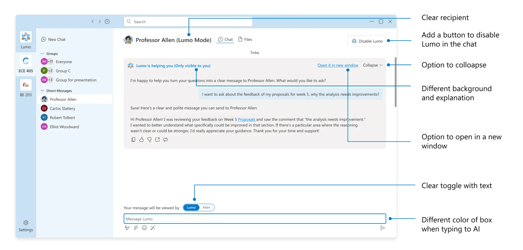
I conducted design critiques with 2 Microsoft designers, presenting prototypes at each stage for iteration. These sessions focused on addressing AI transparency and integration concerns.

Risk of losing context and fragmentation.
Clear human vs. AI distinction
More visual cues (toggle, colors, icons)

Entry point: sidebar clear, other icons missed.
One-stop entry point
Sidebar remains primary
Icon -> floating shortcut

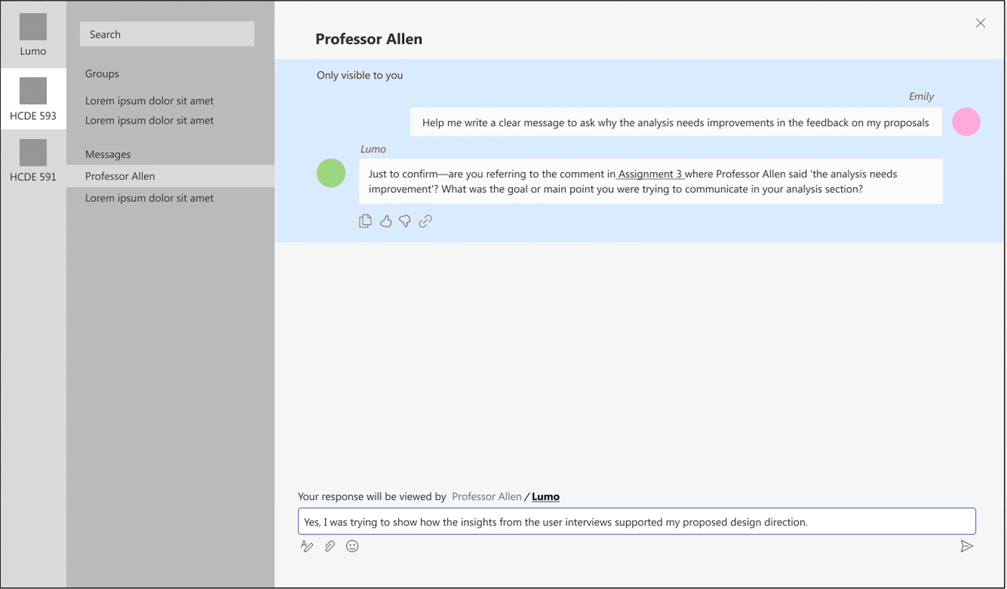
Unclear how to enable Lumo vs. Instructor.
Chat with both
Redesigned message interface
Added buttons and color cues,
DESIGN SYSTEM
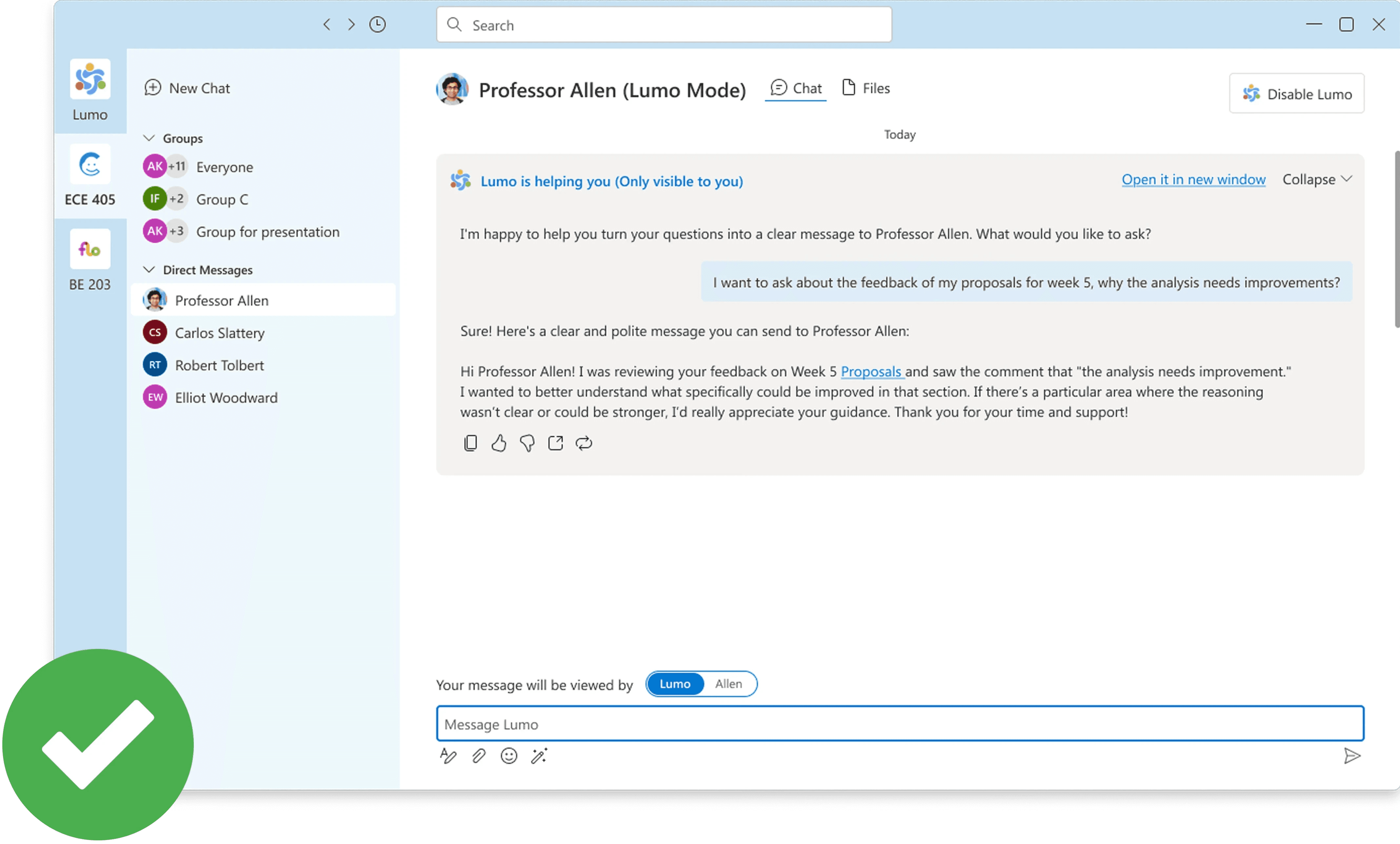
We named it "Lumo".
Built with Microsoft's design system for consistency. The logo shows students and educators in a circle of connection.
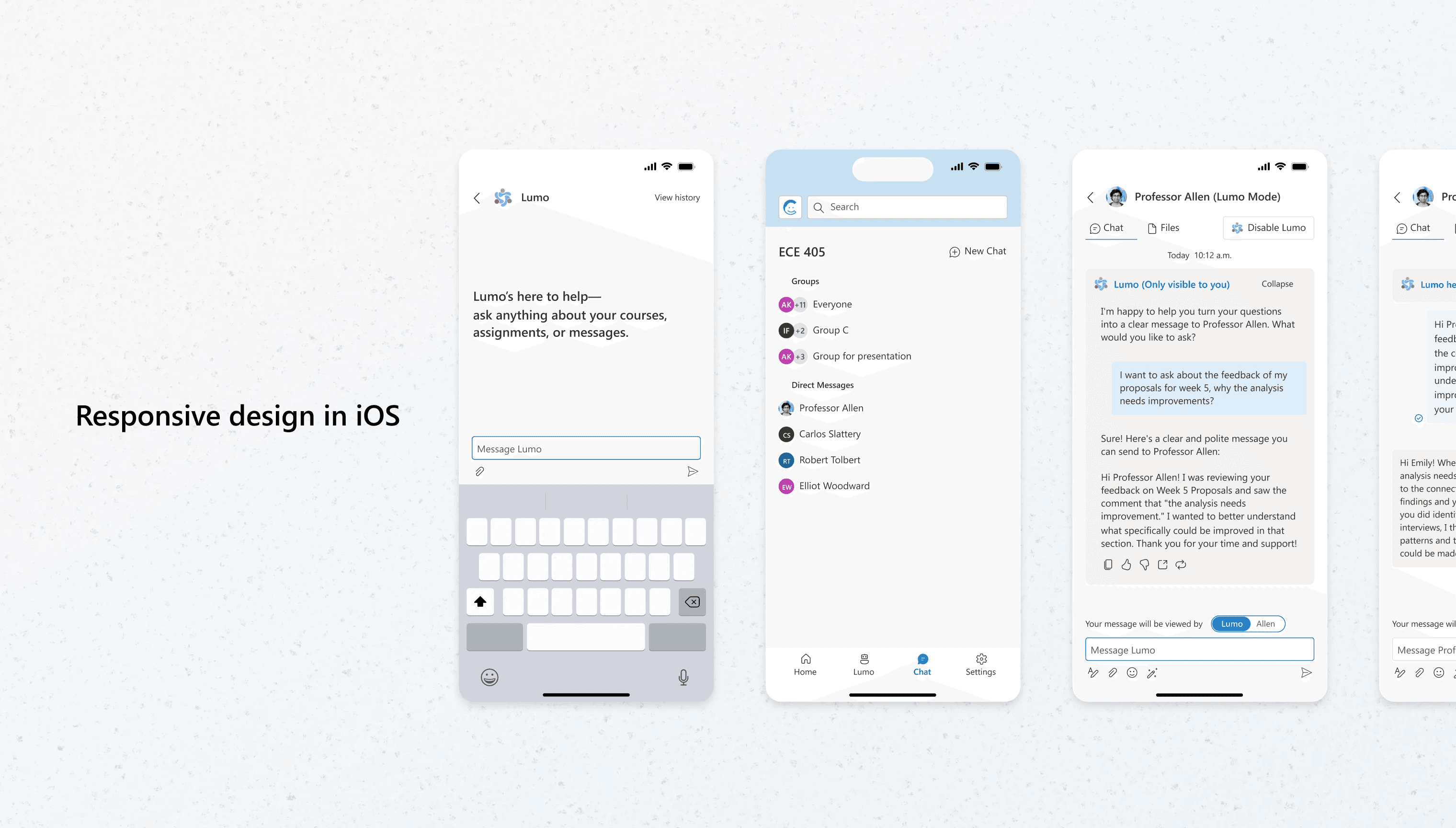
Mobile-responsive throughout.


IMPACT
Lumo saves 4+ hours weekly.
I asked users to complete the same tasks using both the old workflow and Lumo. The results showed users saved 4+ hours weekly and no longer needed to juggle multiple platforms.
"This is what Canvas should have been from the start."
"It's like having a TA who's always awake and actually helpful."
LOOKBACK
"If you want to go fast, go alone. If you want to go far, go together"
Challenging? Absolutely. AI limits, competing users, unfamiliar space. But meaningful work. Education isn't afraid of AI, just bad AI. This project brought so many firsts and plenty I wish we'd finished, but messy and challenging is how you grow. And I'm lucky to have had this team through it all.
