Kidooo AI

Kidooo AI

Designing evaluations that feel personal

Designing evaluations that feel personal

End-to-End Design

AI Evaluation Tool

B2C

EdTech

End-to-End Design

AI Evaluation Tool

[ CHALLENGE ]

8 in 10 new users dropped off without completing a single activity, the product's core value moment.

[ STRATEGY ]

I analyzed behavioral data to diagnose overwhelm, then ran structured experiments to redesign onboarding around one activity at a time with clear developmental context and a refined design system.

[ RESULTS ]

  • 63% increase in signups, generating $40K in revenue

  • 58% increase in task completion

  • 70% reduction in engineering development time

Go to Strategy

OVERVIEW

About Kidooo AI & My role

Kidooo AI is an interactive app for early childhood development that could genuinely help families facing financial and systemic barriers. But 80% of users dropped off before completing a single activity, never reaching the value it was built to deliver.

Kidooo AI is an interactive app for early childhood development that could genuinely help families facing financial and systemic barriers.

But 80% of users dropped off before completing a single activity, never reaching the value it was built to deliver.

My goal was to find out why users were leaving and turn that insight into higher membership conversion and retention.

My goal was to find out why users were leaving and turn that insight into higher membership conversion and retention.

I worked with 2 designers, 1 engineer, 1 researcher, and a PM over six months. I independently drove:

๐Ÿ” User behavior analysis

๐Ÿ“ฑ Mobile UI design

๐ŸŽจ Design system

โœ๏ธ Onboarding redesign

๐Ÿ” Rapid iteration

๐Ÿ“Š Heatmap analysis

๐Ÿงช A/B testing

๐Ÿ” Rapid iteration

๐Ÿ“Š Heatmap analysis

๐Ÿงช A/B testing

๐ŸŽจ Design system

CHALLENGE

8 in 10 users dropped off

I wanted to understand where and why users were disengaging, so I started by analyzing behavioral data including drop-off points, dwell time, and tap patterns.

Users scroll through the activity recommendations on the homepage but not clicking any of them.

Users scroll through the activity recommendations on the homepage but not clicking any of them.

1

No Guidance

No Guidance

All recommendations surfaced at once with no guidance on where to start.

All recommendations surfaced at once with no guidance on where to start.

2

Missing Context

Missing Context

No description of the activity, why it's recommended, or how it helps their child.

No description of the activity, why it's recommended, or how it helps their child.

3

No Clear Action

No Clear Action

No reason to choose, so they chose none.

No reason to choose, so they chose none.

STRATEGY

Laying UX foundations

My hypothesis was that users weren't disinterested, but overwhelmed.

The first impression might be the bottleneck, so I started with adding a progress indicator for daily activities so users can better track and see their milestones.

Before

A linear flow that surfaces all recommendations at once, giving parents no guidance on where to start.

A linear flow that surfaces all recommendations at once, giving parents no guidance on where to start.

After

A guided flow that presents one personalized activity at a time, building trust through context and progress.

A guided flow that presents one personalized activity at a time, building trust through context and progress.

I wanted users to have more clarity and see the value before acting, so I replaced multiple recommendations with one at a time, with descriptions and the reasoning behind each activity.

After synthesizing V1 user feedback, I found parents were overwhelmed by the colors. I proposed a refined design system with 3 mid-saturation colors and reusable components, reducing engineering development time by 70%.

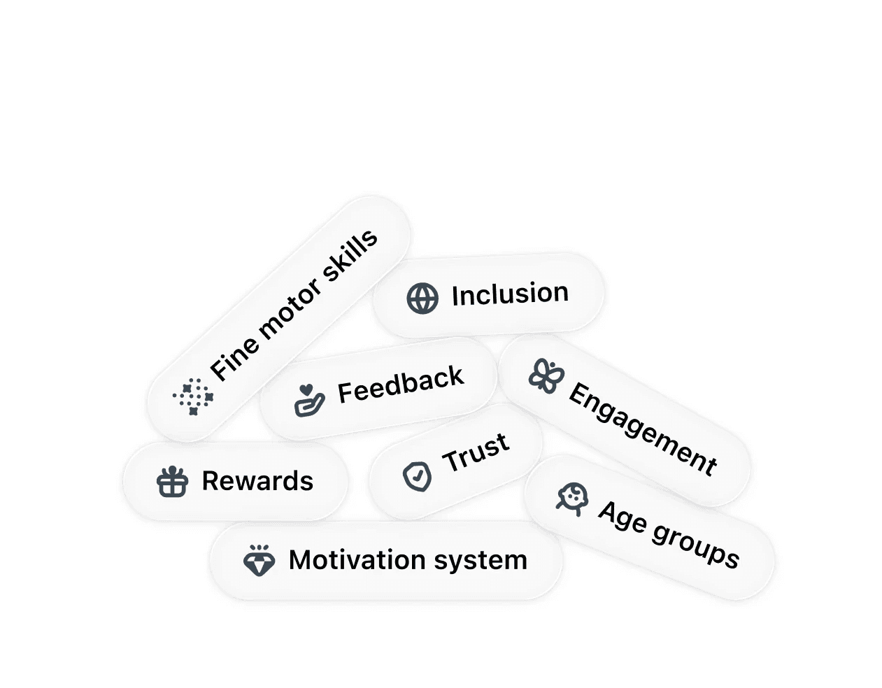
I proposed adding a reward system to drive engagement and user retention.

Internal A/B tests were conducted before launch, testing combinations of color saturation, recommendation density, and presence of a progress indicator. I used heat maps to track what attracted attention across variant.

Internal A/B tests were conducted before launch, testing combinations of color saturation, recommendation density, and presence of a progress indicator.

I used heat maps to track what attracted attention across variant.

Constraints

50%

The balance between clarity and engagement.

50%

The interface needs to feel helpful and earn user trust. Child development is sensitive, and AI in this space requires transparency.

Impact

5000+ signups and $40K in revenue

58% increase in task completion

Reduced 70% in development time

REFLECTION

Design is more than pixels

Designing AI for parents taught me that trust isn't built by showing more, it's built by showing less. When the topic is your child's development, every unnecessary element erodes confidence. Transparency and simplicity aren't nice-to-haves, they're the product.

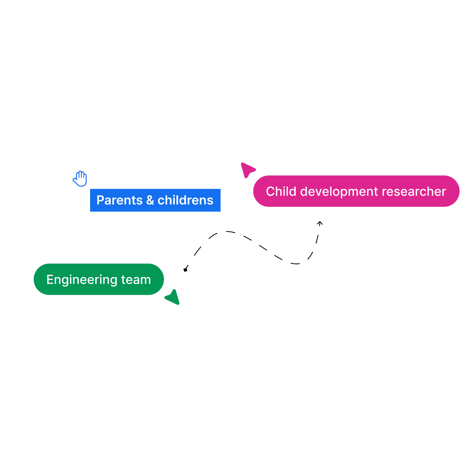
Building the design system also changed how I think about collaboration.

  • With child development researchers, I learned what kids can actually do at each age.

  • With engineers, I learned AI's capabilities and constraints.

  • With families, I learned to speak for them.

Go to Top