Motif Analytics
How usability testing cut user loss nearly in half.

MY ROLE
Lead Researcher
TIMELINE
3 months, Jan-Mar 2024
PROJECT TYPE
Shipped, industry-sponsored project
PROBLEM
Motif lost 70% of users post-signup, but had never tested the full user journey to understand why.
OVERVIEW
As lead researcher, I designed and conducted Motif's first end-to-end usability study with 9 analytics professionals, uncovering onboarding barriers and delivering actionable fixes before their next major release.
SKILLS
CONTEXT
Motif is losing 70% of users after sign-up.
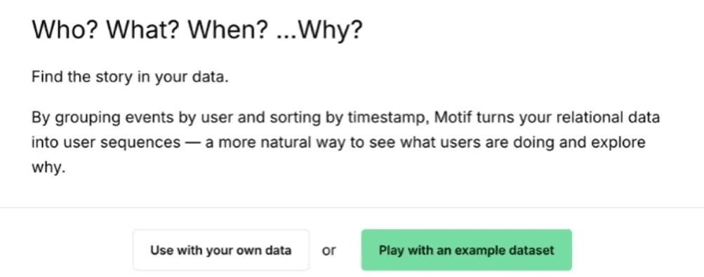
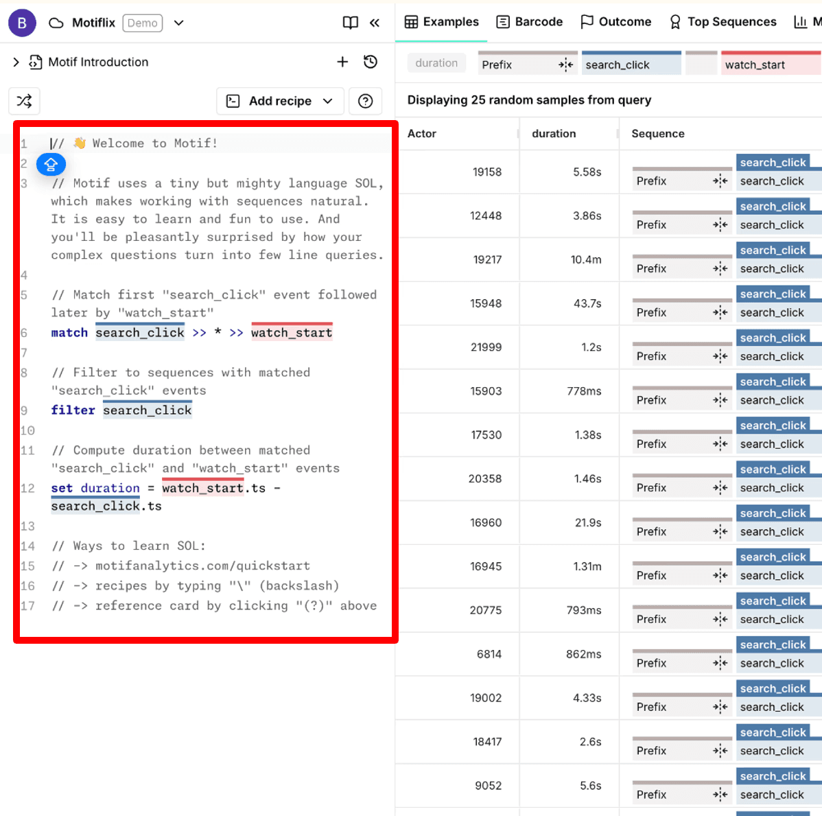
Motif Analytics is a user behavior analytics tool that tracks how people use your product through session recordings, heatmaps, and interaction data.
Despite offering valuable insights, it was losing 70% of users right after signup.

METHODOLOGY
Motif's first end-to-end usability study across real user workflows.
I want to know...
1️⃣ Where are users getting stuck?
2️⃣ Do they understand what Motif does?
3️⃣ Can they complete core tasks independently?

I tested with 9 analytics pros who use tools like Motif daily. They completed real workflows while thinking aloud, and pre/post surveys tracked their confidence drop from signup to use.

I measured three things: Could users find features? Understand them? And see value for their work.
TASK
Open-ended scenarios let data scientists and PMs approach tasks at their own skill level while exposing different usability issues for each.
Scenario 1: Onboarding Prcoess

Onboarding Card

Panel Instructions
Scenario 2: Specific Task

Try with the toolkits

Insert the probided query

Observe
FINDING
No onboarding, No direction, No clarity.
🚫 Users Couldn't Find Onboarding
25% of users never got the welcome email (spam), and 89% couldn't find docs without help.
"I'm approved... now what? Where do I even start?" — P4, Data Scientist
❌ Users Didn't Know Where to Start
67% felt overwhelmed—they couldn't tell where to start or how panels connected.

"There's so much here... I don't know what affects what." — P7, Product Manager
⁉️ Lack Of Definitions
Users couldn't find or understand critical features like inverse, flag, and alignment.

"Wait, it can do comparisons? I had no idea." — P2, Analytics Manager
OUTCOME
User confidence in redoing tasks independently: 2.5/5
What does it mean…
Should we keep shipping features into a product users couldn't navigate, compounding the confusion? Or pause development to fix the foundation and making what already existed actually discoverable before adding more?
The recommendations prioritized reducing friction over adding functionality—a strategic shift that would determine whether new features could actually retain users.
LOOKBACK
Less is more
This project taught me that timing can matter more than findings. Delivering research right before launch gave the team evidence to pause and refocus on fundamentals. With 70% of users leaving, our insights shaped whether Motif would survive or pivot, reminding me that research is a decision-making tool, not just data.
🎊 Thanks to the team for countless meetings and “revisits.”
